Staying ahead of the digital design curve is a critical imperative for businesses looking to make a lasting digital impression. One design trend that has been making waves in recent years is kinetic typography. But is it worth the investment for your website? Let’s explore the world of kinetic typography and its potential benefits.
Understanding Kinetic Typography
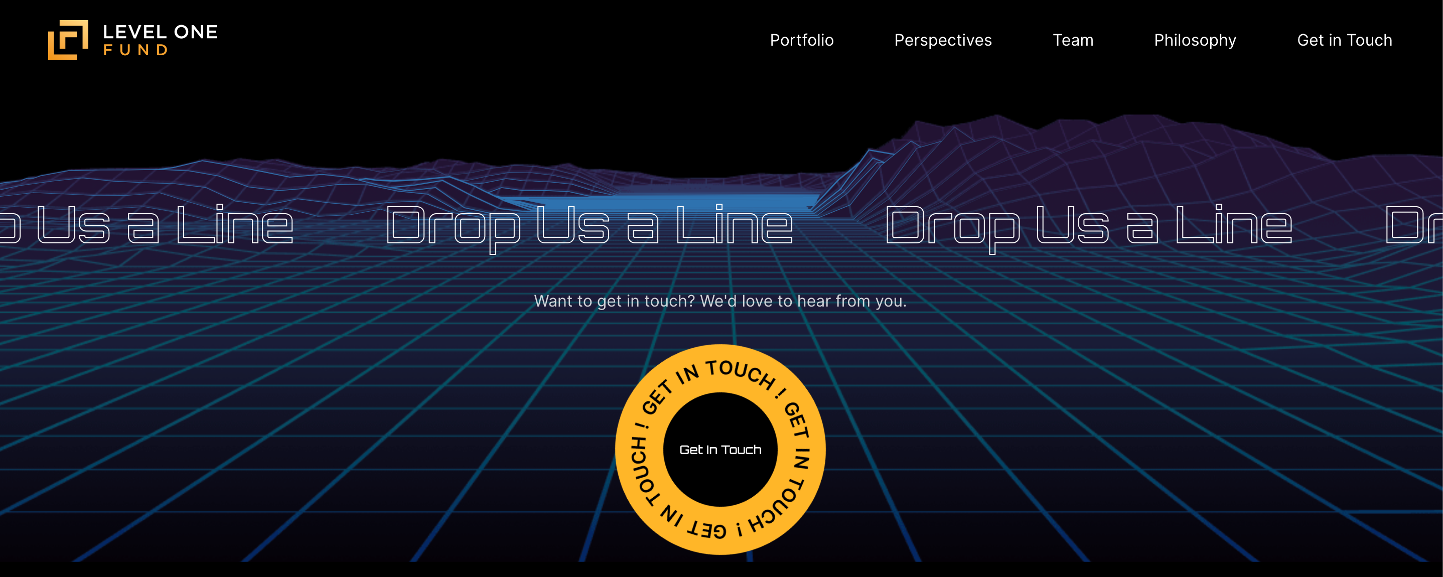
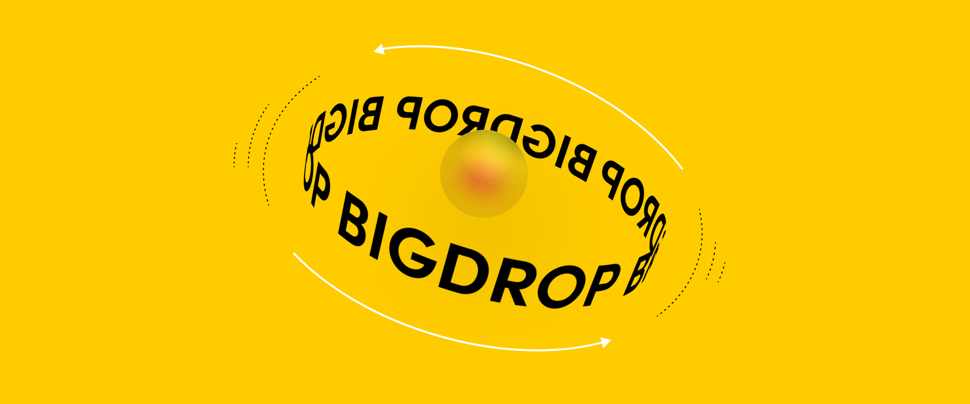
Kinetic typography, often referred to as “kinetic type” or “text animation,” is a design technique that involves the animated movement of text elements on a web page. These animations can range from simple transitions to more complex movements that synchronize with audio or video content. The goal is to make the text visually engaging and interactive, capturing the viewer’s attention and enhancing the overall user experience.
When typography and other elements are brought to life using motion, this draws user focus to important messaging or items that stand out among the more static elements on the page, making their journey through the site as effortless as can be. In addition to effortless scannability and navigation, when select elements are imbued with curated instances of animation, this contributes to the elevated refinement of the entire digital brand ecosystem.”
– Nic Casey, Big Drop’s Senior Director of Creative Services
The Advantages of Kinetic Typography
1. Enhanced Engagement
One of the primary benefits of using kinetic typography is its ability to grab the viewer’s attention and keep them engaged. Dynamic text animations can make your website’s content more captivating, encouraging visitors to stay longer and explore further. This engagement can lead to increased user interaction and a higher likelihood of achieving your website’s goals, whether that’s making a purchase, signing up for a newsletter, or simply staying informed.

2. Improved Storytelling
Kinetic typography can be a powerful tool for storytelling. By animating text in a way that complements your content, you can convey your message more effectively. This is particularly useful for businesses looking to explain complex concepts, share their brand story, or create compelling narratives on their websites. Kinetic typography can bring words to life, making your message more memorable.

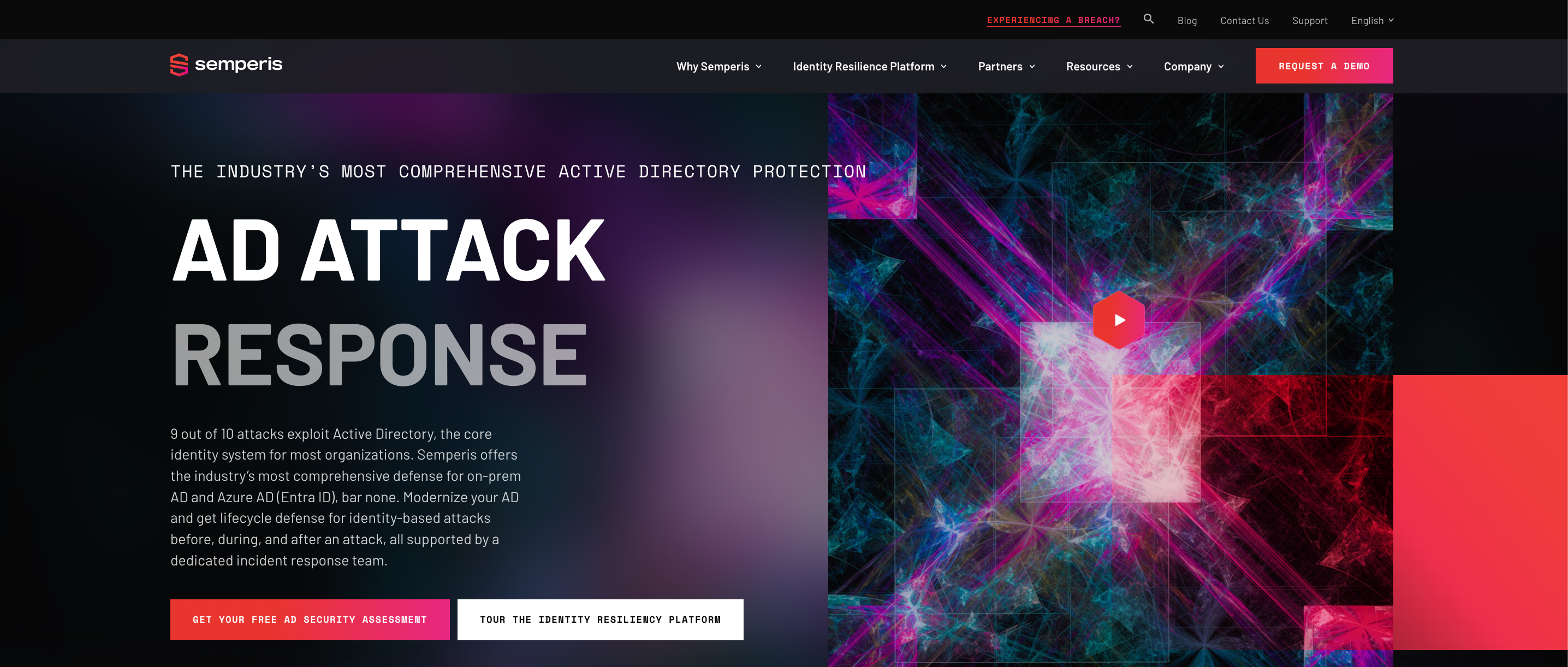
Check out our work with Semperis.
3. Aesthetic Appeal
A well-executed kinetic type design adds a touch of elegance and professionalism to your website. It can set your site apart from competitors and leave a lasting impression on visitors. When done right, kinetic typography not only improves the visual design of your website but also enhances its overall aesthetic, making it more appealing and modern.

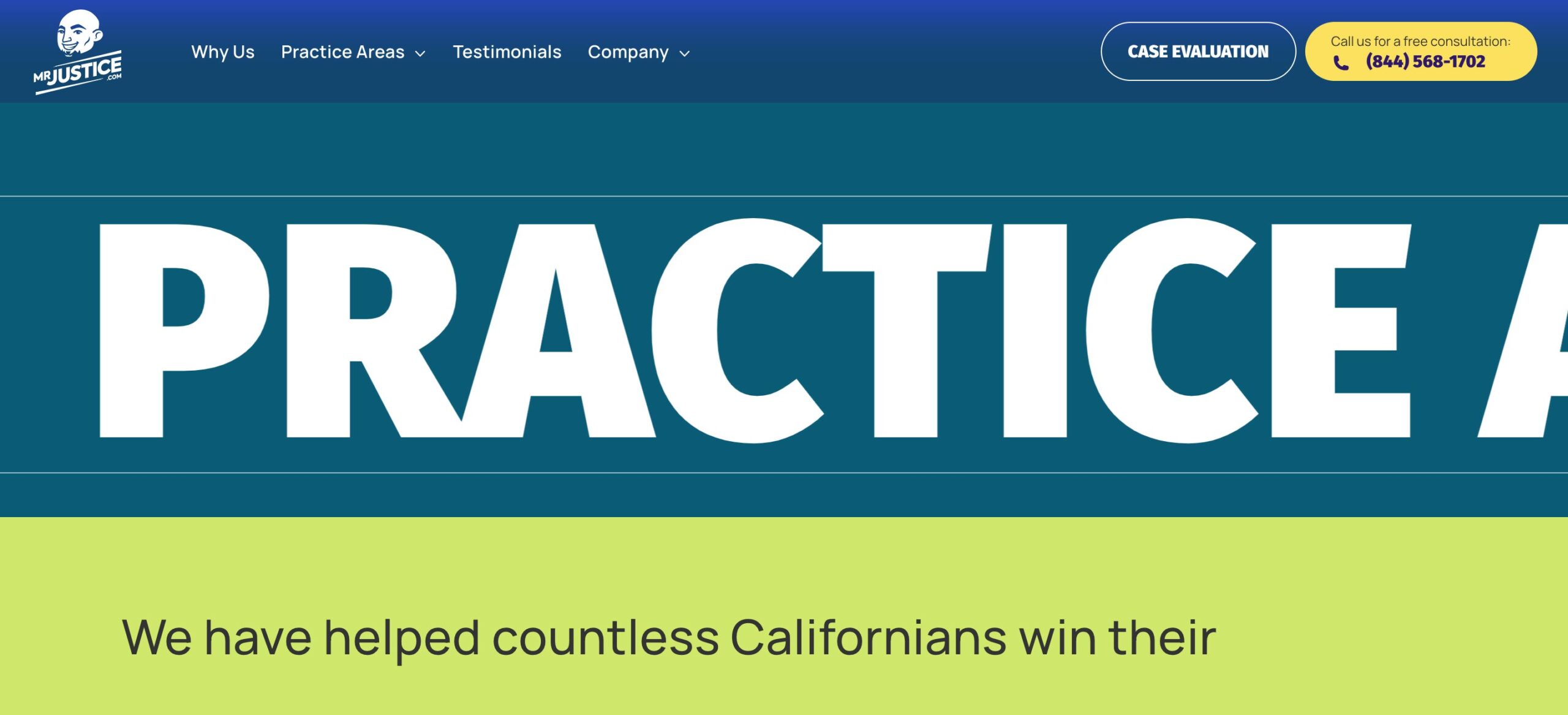
Check out our work with Mr.Justice.
4. Mobile Responsiveness
In today’s mobile-centric world, responsive web design is a must. The good news is that kinetic typography can be optimized for mobile devices, ensuring that your animations work seamlessly across various screen sizes and resolutions. This means that you can provide a consistent and engaging user experience to all your website visitors, regardless of the device they’re using.
Factors to Consider
While the benefits of kinetic typography are significant, it’s essential to consider a few factors before incorporating it into your web design project:
1. Loading Times
Animated text can increase page loading times, which may negatively impact user experience. To mitigate this, optimize your animations for performance and prioritize loading essential content first.
2. User Accessibility
Not all users may appreciate or benefit from kinetic typography, particularly those with disabilities. Ensure your design maintains accessibility standards, providing alternative text or options for users who rely on screen readers.
3. Balance and Moderation
Like any design element, balance is key. Too much animation can overwhelm and distract users, so use kinetic typography strategically and in moderation to achieve the desired effect without overloading your website.
Is Kinetic Typography Right for Your Website?
Ultimately, the decision to use kinetic typography on your website should align with your brand identity, target audience, and website goals. For some businesses, especially those in the creative or entertainment industries, kinetic type can be a game-changer, helping them stand out and engage their audience effectively. For others, a more conservative approach may be better suited.
In conclusion, kinetic type is undoubtedly a valuable design technique that can enhance your website’s engagement, storytelling, aesthetics, and mobile responsiveness. However, its effectiveness depends on how well it aligns with your specific needs and goals. When considering kinetic type for your web design project, weigh the benefits against the potential drawbacks, and make an informed decision that will help you create a website that captivates and converts your audience.
Reach out to Big Drop today to discuss if kinetic typography is right for your business.
