The design of healthcare websites is changing at a rapid rate. The health industry is at a crossroads in today’s digital age, and it’s ready for change. As a result, creating a modern healthcare website is a critical first step in preparing for the digital-first patient experience. To deliver healthcare services and improve the digital-first user experience, healthcare providers must adjust their websites’ designs. Aaron Sines, Big Drops Vice President of Business Development, stated the following:
We’re hearing more and more from our healthcare clients about their desire to embrace a customer-centric digital strategy. With increased emphasis on enhancing the patient experience and facilitating a more frictionless delivery of care; we view our clients’ digital presence as the most critical component of enabling this transformation.”
In this post, we will provide some of our favorite examples of web design for healthcare. It will help you create a personalized experience that is engaging, easy to use, and meets the needs of digital-first patients. We have also included a list of some of our most successful healthcare designs at the forefront of the medical industry’s digital landscape.
Big Drop’s Work
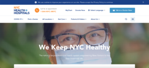
NYC Health + Hospitals

NYC Health + Hospitals provides essential inpatient, outpatient, and home-based services to more than one million New Yorkers every year. The scope of this engagement is to design and develop a new digital presence for NYC Health + Hospitals that focuses on seamlessly providing key information to target audience members while providing an updated visual design to illustrate NYC Health + Hospital’s core values and missions.
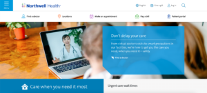
Northwell Health

Northwell Health is a nonprofit integrated healthcare network that is New York State’s largest healthcare provider and private employer, with more than 74,000 employees. By focusing on customer-centric user journeys and the patient experience, Big Drop was able to provide Northwell with a vastly improved user experience across key components of their digital presence all throughout a branded experience. By providing a high-performing digital infrastructure, we helped Northwell make patients’ lives easier, speedier, and more connected; building trust while keeping users engaged through immersive content and a clean UI.
Outside Examples
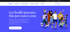
Oscar

Oscar Healthcare is focused on utilizing technology, design, and data to humanize health care. They do a great job at providing their audience with engaging health-related content. Oscar uses friendly, well-written copy that matches the visual design of the interface to create an easy-to-navigate site. They also provide users with an extensive navigation menu for exploring health information related to health insurance plans and resources for members, brokers, and providers.
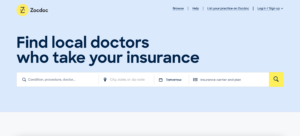
Zocdoc

With a mission to give power to the patient, Zocdoc’s online marketplace delivers the accessible, seamless, and simple experience patients expect and deserve. Zocdoc’s website features a clean, straightforward information architecture. The navigation menu does a great job of quickly pathing/segmenting users based on the category of specialty care. The use of simple, straightforward navigation, combined with the prominent display of the search function in the middle of the home page, greatly enhances the usability of the site.
Clover Health

Clover Health aims to provide great care, in a sustainable way, by having a value-based care model built around improving medical outcomes while lowering avoidable costs. Clover’s website features dynamic images and colors to engage the viewer. From the contrasting green color palette to the use of iconography throughout the site, the consistent use of rich, colorful photography helps promote a sense of excitement and optimism. The use of greens and blues for the header of the site was a great choice to promote feelings of health and well-being.
Final Thoughts on Healthcare Websites
When it comes to healthcare, having an online presence is critical to attracting and retaining customers. A well-designed website is the core of a strong online presence. The best healthcare websites are easy to use, have clear branding, powerful functionality, and are easy to update. These examples show how designing your healthcare website with audiences in mind will ensure that you get the right design and functionality to build a powerful digital presence. Big Drop’s Creative Director, Nic Casey, says:
Patients are interacting with their healthcare providers on their digital devices more frequently. This presents myriad opportunities to align the digital experience with the high-quality in-person patient experience, ensuring a consistent and cohesive brand experience. In addition to a clean and legible user interface, it is vital to have a well-curated, multichannel user journey in a place that empowers patients to be autonomous and find what they are looking for as quickly and efficiently as possible, on a device of any size.”
Learn more about how Big Drop can help your healthcare organization’s website become like these other top sites. Get in touch with the Big Drop team today.
