NACS logo

North American Credit Services (NACS) is a leader in the technology used for processing and collecting insurance and self-pay accounts; providing online communications, and allowing users to access their accounts seven days a week, twenty-four hours a day.

Where Values Set the Standard

When looking to rebrand, redevelop, and redesign its current digital presence, NACS turned to Big Drop for assistance. The goal of this engagement was to create a website that would have a modern approach, align with branding and messaging, and create a better user experience. In addition to rebranding NACS, we also completed a rebrand for their sister brand Medical Services – through our branding engagement, we renamed as MedSrv.

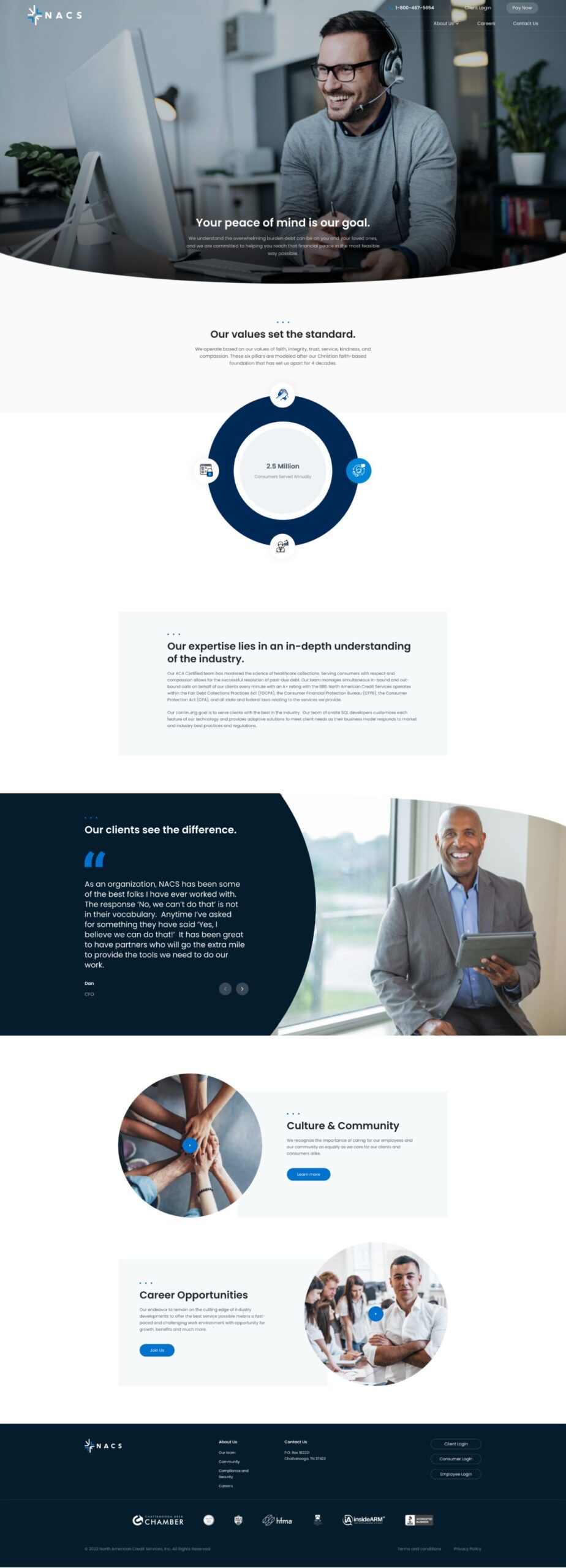
We set out to emphasize NACS's hassle-free, solution-oriented services. In doing so, Big Drop highlighted NACS's unique approach that focuses on solutions, consideration, and understanding. It was important for the rebrand and website to showcase NACS's mission, services, and values for (1) current and potential clients, (2) consumers, and (3) current and potential employees – with respect to user experience, tone, content, and education.

In order to create user journeys conducive to information discovery, we implemented an information architecture strategy that conveyed both the company story and services in a clear, digestible manner. The logo and website refresh paid homage to the foundation and legacy the organization was built on. In doing so, the new digital presence portrayed a contemporary visual language that helps establish the organization as a trustworthy industry leader, instilling confidence in Clients and Consumers.

After implementing an information architecture strategy that would create a clean foundation for content, we then focused on top-notch customer service. We made a digital presence that showcases NACS’s kind, caring, and trustworthy side. Along with this, we update the look and feel to be as welcoming, human-centered, and solution-oriented as the people who make up the team.

When focusing on user experience, it was important for NACS to align with its core organizational values, and treat its user with dignity and compassion by making the website clear and easy to navigate. Once users arrive at the website, the path to accomplishing their goal will be made simple and straightforward. Big Drop was able to evoke a sense of brand credibility and excitement from audience members, keeping users engaged as they are pathed toward various CTAs.

Through this engagement, Big Drop was able to provide the company with a robust digital presence that focuses on solutions, consideration, and understanding. By focusing on the user, aligning NACS’s branding and messaging, and modernizing its approach; Big Drop created a digital experience for NACS that shows its leadership in the industry.

Homepage:
NACS

Want to collaborate on a future-forward project?

Let's Talk

We collaborate with innovative brands to create cutting-edge digital experiences. Let's connect.